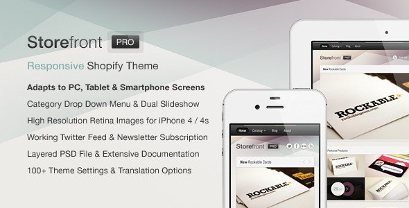
Storefront Pro for Shopify is a responsive shopping cart theme written in HTML5 / CSS3, which provides a convenient way for your customers to buy your products at home or on the go and which seamlessly adapts to your customers screen sizes no matter if they use a desktop pc, a tablet or a smartphone to view your site.
Highlights
- M-Commerce ready
- 100+ Theme settings to customize it to your needs
- Beautiful, handcrafted design
- Clean, quality source code written in valid HTML5 and CSS3
- Crystal clear retina images for iPhone 4 / 4s
- Dual product slider
- Dynamic collection drop down menu (touch friendly)
- Working twitter feed
- Prepared newsletter subscription form
- Layered PSD file
- Also available as HTML Site Template without Shopify integration for just $15!
Documentation & Support Even though a detailed documentation has been included for your convenience, you can of course always send me an email to [email protected] or leave a comment whenever you should have some kind of question, need my help or maybe got a suggestion how to improve this theme even further. Any kind of feedback is appreciated and I usually try to answer to your requests within 24 hours but most of the time even faster, so don’t hesitate to contact me at any time!
Updates
- 02/09/2012 Theme settings to add links to slideshow items added.
Other Shopify Themes
Need help? Theme not working or getting an error?
- Try contact authors: obest
Theme details
Last Update | 10 February 12 |
Created | 4 February 12 |
High Resolution | Yes |
Compatible Browsers | IE7, IE8, IE9, IE10, IE11, Firefox, Safari, Opera, Chrome, Edge |
Software Version | Shopify 2.0, Other |
ThemeForest Files Included | Layered PSD, CSS Files, JS Files |
Columns | 2 |
Documentation | Well Documented |
Layout | Fixed |
Tags | drop down, ecommerce, html5, iphone, mobile, responsive, retina, settings, shop, shopify, shopping, slider, slideshow, smartphone, tablet |